Wednesday, March 30, 2011

Designers Who Inspire. #3 Peter Dunham

If you have never seen the work of Peter Dunham, then you are in for a real treat!  Born in Paris, and raised in England his designs have a worldly, exotic feel to them, but still very classic.  He now resides in Los Angeles and has a store called Hollywood at Home, where he sells his own fabric and furniture lines among other decorative goodies.


A shot of his store, Hollywood At Home.  This "room" is an example of how to do everything right!  From the  color palette, to the mix of graphics with florals, to the abstract artwork, to the large lamps with the simple drum shades, it is perfect in my eyes!  It has a real layered look as if it has been collected over time, which I love.  This shot alone makes me want to hop on a plane to L.A. to go to his store!


Dunham's own Los Angeles home.  It has a great mix!  I love that print that looks like green leaves on the chair.  That is one from his line of fabrics.  It is called Fig Leaf.


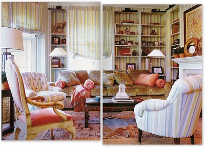
Another shot of the above room.  I love that striped chair!  And I see my favorite print peeking out on the curtains.


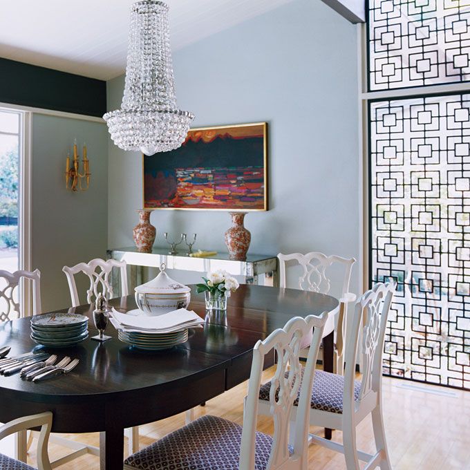
I could sit here and look at books and magazines all day!  Love that shot of red from the chandelier!  It looks like it is coral?


Here are some more pictures of some of Peter Dunham's work.


There is my favorite print again on the banquette!


A neutral room with many textures to bring it to life!


There is my favorite print again to liven things up!  Love the striped rug!  Don't be afraid to mix patterns in your own home.


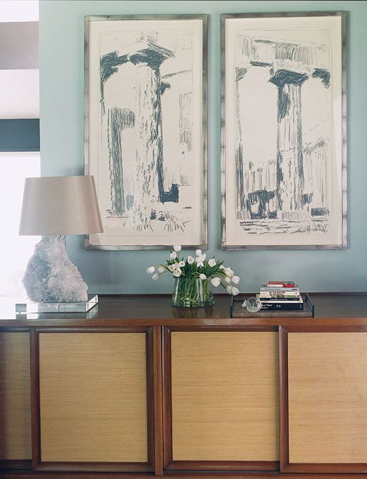
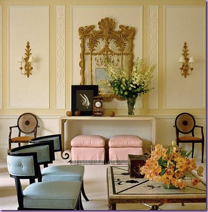
 This room could look a little granny if not for the extra large abstract paintings.  I wonder if my kids could create something like that!  HaHa!


This room could also be borderline granny, but look at the lamps on either side of that lovely tufted sofa.  Chinese vases on the bottom, with simple drum shades on top.  That's what Peter Dunham does best, he takes a classic room and updates it with lamps and modern artwork.


I will be filing this image under dream bedrooms!


I see a changing table, so this must be a nursery.  If I hadn't noticed the diapers, I would have never known this room was designed for a baby.  See?  You don't have to decorate your nursery in a Winnie the Pooh motif.  Unless you really like Winnie the Pooh, then of course you should.


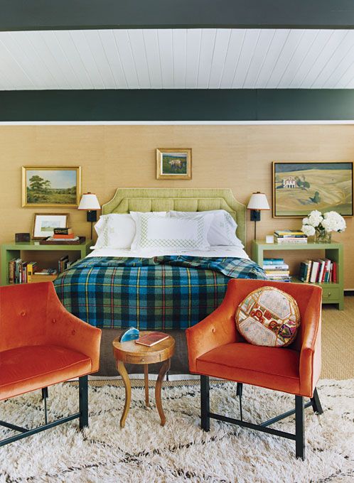
I see my favorite print!  Again, a great layered look.  Notice the lamps on each side of the bed.  Nice, simple drum shades without a bead or fringe on them. And the scale and height is perfect.  Skimpy lamps that are too short is a real pet peeve of mine!


Of course I had to show this picture because it's got my favorite print all over it!


Some things to consider if you want this look for your own home!

Don't be afraid to mix patterns.  Stripes, florals, graphics they all work well together.  Throw in an ethnic print and that will look great too!  Of course, don't go too crazy with pattern, have some solids to balance things out.  And they should be in a similar color palette.


Big, bold lamps with simple drum shades.


Traditional artwork mixed with abstract artwork, plates hanging on the wall, which I am a huge fan of.


Lots of textures, sea grass, wicker, rattan, shells and coral.


Peter Dunham's rooms have a cozy layered look that comes from lots of books and accessories and pillows and throw blankets.  His rooms are definitely not minimalist!

For more inspiration, check out the rest of his portfolio here.

Sunday, March 27, 2011

Another Cool House!

Ok, I know I said that looking at cool houses made me tired and that my house will never be cool and here I am showing you another cool house!  I can't help myself!  Look how cool this house is!!

Images from here.


The foyer of designer Michael Katz.  Yes that is a chrome bench from the 70s and yes I now want one.


The living room is gorgeous, although so not practical for someone who likes to sit on the couch while eating snacks and has two kids, two dogs, and a husband.  But I do love the vintage chrome chair recovered in a Lee Jofa fabric and the lucite coffee table.  And the lamp.  And the artwork.


The kitchen is black, and modern, and cool.  The bar stools are actually from Pottery Barn!  Who knew Pottery Barn was so cool?


The dining room with a glass table surrounded by Milo Baughman chairs.  I don't really know who that is, but it took the designer two years to collect the set!


A sophisticated living room.  The vintage looking wicker stool is not vintage at all.  It is from Crate and Barrel.


I love the bed in the master bedroom.  And no the walls are not made of cinder blocks.  That is a textured wallpaper.  Not many people would have thought to put an antler chandelier in this room, but it works!


A cool vintage rattan chair in the master bedroom.  Very exotic looking.


Nice bathroom!


So how can you up the cool in your house?


A neutral  palette with shots of color here and there.

Mix different textures and finishes to add interest.  Chrome, wicker, wood, lucite, an animal hide rug.

Clean lined furniture.  Check the thrift stores for vintage 60s and 70s chrome and rattan chairs and tables.

Lamps with simple shades without any fussy beads or trims.

Modern and quirky artwork.  Again, thrift stores and estate sales are excellent places to find unique artwork.

A big wicker/rattan basket to throw all of the kids' toys in!


I don't know about you, but the next time I am at my favorite resale shop and I see something that looks like it was in my home as a kid, I might just give it a second look!  Maybe I can have a cool house after all!

Saturday, March 26, 2011

Cool House!

Today we are going from a cute house to a cool house.  Loving this clean lined ranch featured in Domino Magazine.  I could move right in.  Images from here.

Photobucket

The outside of the long ranch.  Beige with a bright pop of red on the front doors!


Photobucket

Love the clean lines in this living room mixed with the ornate mirror. I also really love that graphic rug!


Photobucket

Another shot of the living room.  Interesting color palette of persimmon, black, taupe, and icy blue.


Photobucket

I love the red credenza and the patterned sectional sofa.


Photobucket

Neat lamp and drawings.


Photobucket

The dining room.  I love the white painted chairs with the dark wood table.  The painting is cool too!


Photobucket

I have seen this image many times and LOVE everything about it!  So happy to see the rest of the house.  I am still loving the very popular Chiang Mai Dragon fabric on the chairs.


Photobucket

The master bedroom I am assuming.  I love the bed and the grass cloth on the walls.


Photobucket

Cool bedroom for the kids.  A great mix of patterns and colors!


When looking at this house I not only get inspired, but also tired!  My house will never look this cool!  With 2 kids 5 and under, my house will never look this clean!  I have a list of projects that I want to get done but finding the time is proving to be impossible!!  I have to remember that these pages come from a magazine, with stylists that came in and made everything look just so!  I am just going to enjoy my house as it is now, instead of quickly moving on to the next project!!


Contentment for women is so hard but so important to pray for and be intentional about as we make homes.  Holly Mathis.

Tuesday, March 22, 2011

Cute House!

Hubby found a cute house on the real estate listings and I thought I would share it with you.  It is really cute!  Looks like it should be in a magazine!


Main Image
I love the outside!  Great curb appeal!  Hubby just pointed out the striped curtains on the front porch.  Not sure about those!


Main Image
I like the staircase and the old, big F hanging on the wall!  Maybe that is the homeowner's initial?  Cute!!


Main Image
Beautiful faux mantle!


Main Image
Another shot of the same room.  This time they turned the chairs.  Love the colors!

Main Image
Cute bench in the dining room!  Another faux mantle.  It reminds me of our first home where we had a faux mantle that hubby bought me at a flea market for my birthday.

Main Image
Nice kitchen!  Very modern for an old house!


Main Image
I like the industrial stools!


Main Image
Love the chandelier!


Main Image
Cool frame!  You can find great old frames at thrift stores and take the picture out.  This frame looks good with nothing in it!


Main Image
I like the lamps.  They are the right size for next to the bed.  Not too short or skimpy!


Main Image
Interesting bathroom!  Not a fan of stained glass though!


Main Image
Another bedroom, another pretty chandelier!


Main Image
Cute pink crib in nursery!


Main Image
Cute!!


Main Image

Cute old looking bathroom!


Main Image

I like this bathroom.  I wonder if those are actual pages of a book, or just wallpaper.


To view the listing go here.

Wednesday, March 16, 2011

East Coast Style

I got my latest issue of House Beautiful Monday and I have been enjoying it this week.  I was really inspired by the cottage in Maine designed by Tom Scheerer.  Here are the pictures from House Beautiful in case you missed it.


Outside shot of the summer home on Somes Sound in Maine.


I really feel drawn to this room!  It is an interesting mix to say the least.  From the Victorian sofa, to the Saarinen coffee table, to the wicker chairs, to the chintz curtains, to the ornate Empire mirror, it looks like a mish mash of furnishings collected over time.  But, I'm sure there was a plan behind the combination.  It wasn't just thrown together haphazardly!


The dining room, with a mix of formal scenic wallpaper and informal bentwood chairs and sea grass rug.


I keep opening my magazine to this picture to study it.  I love the tufted sofa and the vintage rattan coffee table.  The circle on the table is actually a vintage basketball hoop.  I also love the lamps and of course the chintz curtains.


The staircase, with its fun collection of bird prints.  The runner brings so much interest to the stairs.


The master bedroom is a mix of patterns and colors, but still feels very soothing!


Not a typical boy's bedroom!  The wallpaper is the very trendy Spatter by Hinson.  I love how it is mixed with an old quilt and a bed inherited from grandma!


More great wallpaper in this bedroom!


I would love to spend the summer in this bedroom!  Tom Scheerer says that the fabric used in this room is very granny, but he updated it with an unusual headboard that spans behind two twin beds.  The striped bed spreads also give it an edge.


The kitchen banquette.


The porch filled with wicker furniture, a necessity for a summer house!


While looking at the pictures of this house, I kept thinking it reminded me of another designer whose work I really admire, Jeffrey Bilhuber.  It turns out that Tom and Jeffrey had a design partnership from 1985 to 1995     Their styles are very similar.  Here are some rooms designed by Jeffrey Bilhuber.


Look at those lime chairs and colorful abstract painting!  Looks gorgeous with the dark walls.


Love the mix of pale blues and corals in this room.  I also like the rug layered on top of the sea grass rug.


I like the wallpaper and the artwork highlighted by picture lights.  I like to use picture lights to accent my artwork also.  I bought mine at Home Depot years ago.  They add nice ambient lighting.


The above images were found here.

The pictures below are of Jeffrey Bilhuber's own New York home featured in House Beautiful.


As much as I like a streamlined modern room, I love this almost cluttered style.  It has a real preppy, country club, Nantucket vibe to it.  It is a style that develops over time and lends itself to families with young children. You can put a newspaper down on the coffee table and it won't ruin the look of the whole room like with some styles.  It is very comfortable.

 You don't have to live on the East coast to bring the style to your home!  This style is characterized by:

Traditional furnishings mixed with rattan and wicker and even some modern.  Looks like it was collected over time, or passed down from your grandparents.

Bright happy colors on the walls and furnishings!  Think pale blue, coral, pink, and lime.

Mix of patterns.  Chintz, ticking, florals, "granny."  Using these patterns in unusual ways makes them almost modern.  Granny patterns that are so out of style and unexpected that it makes them seem edgy.

Anything goes artwork.  From elaborate mirrors, to abstract paintings, to portraits, they all work together!

Quirky accessories!


I have always loved this style and seeing the cottage that Tom Scheerer designed just reinforced that.  I am happy that my Staffordshire dogs and abstract paintings can live together in one room!  Now I am off to look through my stash for the fabric piece I never wanted to use because it was too granny!