All images from Palmer Weiss' portfolio.

The lovely Palmer Weiss

I admire the lighting choices that Palmer chooses in all of her interiors. The pendant lights over the island bring a modern touch to this traditional kitchen.

The kitchen eating area has beautiful windows and a fun, happy color palette! The large lantern above the table is a great choice!

I love this wallpaper! Wallpaper has made a comeback which I am happy about. I have wallpaper in both of my bathrooms, but I would love to have it in every room!

This living room looks so fresh and cool. Not your mother's living room, unless your mother is fresh and cool.

Notice how she uses a sculpture on the wall instead of a picture. It adds great texture to the room. It looks like something from the 70s that I might find at the thrift store. I mean that in a good way! Actually, I think it is a Curtis Jere wall sculpture that is probably from the 70s. So if you see something that looks like that at the Goodwill, buy it!

Don't be afraid to use a chest of drawers in the living room. It is a unique design element in this room.

Palmer could have gone with a more traditional chandelier, but this sphere makes a dramatic statement. Have fun with your lighting.

Here is a similar look at Home Depot.

The gloss white buffet is a striking contrast to the brown grass cloth, and it ties in to the chairs.

This kitchen is a more modern style. Check out these Bertoia style bar stools here.
.jpg)
I am longing for a booth in my kitchen, but it is not big enough. I saw one in a show home back in 1998 and have wanted one ever since. The pendant light is reminiscent of this one from Ikea.


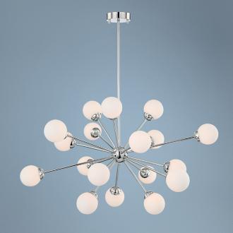
The sputnik chandelier in the hallway is awesome, but they don't come cheap! Lamps Plus has a good one that is reasonably priced here.


This modern living room has a 70s bohemian vibe to it that I like!
.jpg)
Never too early to start teaching the kids about good design! Palmer has two young kids, so her interiors are family friendly.
.jpg)
Sleek bathroom!

A more traditional room! The color palette of orange and robin's egg blue makes it interesting.

Looks like a cozy place to relax and watch tv!

The zebra print runner adds a touch of drama to this entry way!

A sweet room in raspberry, pink, green, and white. I love the chandelier with the bare bulbs. Bulbs without shades is a trendy look these days, but is best used with a dimmer. If you like the look, buy this one from Ikea and paint it white, or whatever color you desire!


I love the icy blue with the emerald green. Must incorporate this color combo into my home somewhere. Immediately.

A traditional room with a more modern style lamp.

I love this room! I am using this as inspiration for my daughter's bedroom!

Oh my gosh!! So cute!!! This room could easily go from a 5 year old to a 15 year old.

I love the mix of the mid-century modern chest with the double gourd lamp with the wallpaper and the seagrass carpet. Traditional meets modern!

The chair is another modern touch to keep the room from being too sweet.
So do you have a favorite Palmer Weiss room? Check out the rest of her work here.
To see other Designers Who Inspire, go here, here, here, and here!
No comments:
Post a Comment